There's a certain kind of Mac app that never asks for your attention. It has no Dock icon bouncing for a click, no window that fills the screen, no onboarding tour. You install it, grant it a permission or two, and then it disappears into the top-right corner of the screen — or into a keyboard shortcut you'll use fifty times a day without thinking.
We've been keeping a list of the apps we actually reach for, and the pattern is hard to miss. The best ones are barely visible.
What "native" started to mean
When people say an app "feels native" on macOS, they used to mean it looked the part: the right controls, the system font, a toolbar that matched Finder. That still matters. But the bar has quietly moved.
A native-feeling app in 2026 is one that respects the shape of your attention. It shows up when you summon it and gets out of the way when you don't. It leans on the parts of macOS that are already there — the menu bar, Spotlight-style launchers, Quick Look, Shortcuts, the share sheet — instead of rebuilding them worse.
Three things tend to be true of the apps that clear this bar:
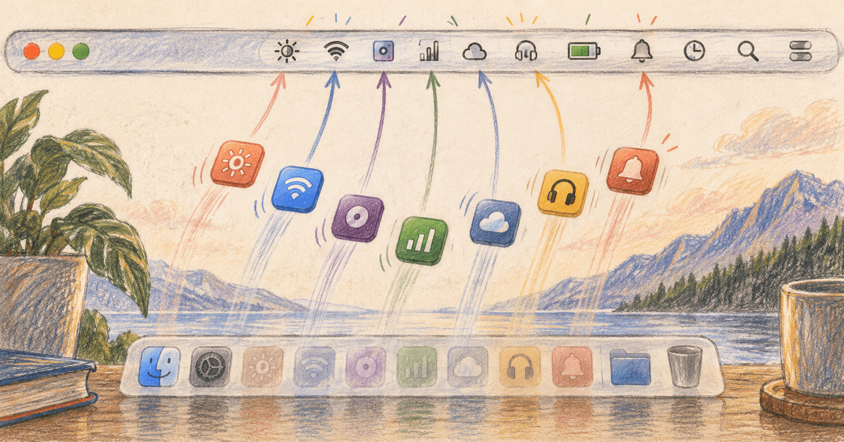
- They have a home in the menu bar, not the Dock. The Dock is for things you look at. The menu bar is for things that watch your back: clipboard history, window tiling, audio routing, a battery you actually trust.
- They're driven by the keyboard. A global hotkey is the whole interface. The window that appears is small, centered, and gone the moment you're done.
- They compose. They read and write the same files everything else does, expose a Shortcuts action, and never trap your data in a format only they can open.
The Dock isn't going anywhere
None of this means the full-window app is dead. A design tool, a code editor, a DAW — these earn the whole screen, and they should take it. The Dock is still the right home for the handful of apps you live inside all day.
The shift is in the long tail: the thirty small utilities that used to each want a slice of your screen and now, correctly, want none of it. That's where macOS has gotten genuinely better, and it's where indie developers are doing the most interesting work.
How this shows up on MacNative
It's why so many of our picks land in the Utilities and Productivity categories, and why "does this need to be a window?" is one of the first questions we ask when something gets submitted.
An app that hides well is an app that trusts you to know when you need it. That trust — more than the toolbar spacing — is what makes something feel like it belongs on a Mac.